Homely
A Smart Home Application
UX Case Study
Duration:
12th June - 30th August
(6 weeks)

Product Overview
Homely is a smart home application designed to streamline the user experience of managing and controlling various smart home devices. The app aims to centralize control, offering users a seamless interface to monitor and interact with their smart devices.
Responsibility
Lead UI/UX Designer
Tools
Problem Statement
Tech-savvy homeowners often find managing multiple smart home devices fragmented and inefficient. Users struggle with inconsistent interfaces and lack of centralized control, leading to a frustrating experience. Homely aims to solve this by providing an intuitive, unified platform that simplifies device management and enhances overall convenience.
Goals
The primary goal of Homely is to provide users with a centralized platform to manage all their smart home devices efficiently. The application aims to feature an intuitive and user-friendly interface, reducing the learning curve for users.
Design Process
In this section i have explained , what was the overall process for me to design this particular project and what steps i have taken .
Understand
User Research
User Interview
Competitve Analysis
Define
User Personas
Empathy Map
User Journey
Ideate
User Flow
Design
Wireframe
Hi-Fi Designs
Prototype
Test
Feedbacks
Conclusion
Future Concept
Design Timeline
1st week
2nd week
3rd week
4th week
5th week
6th week
Understand
User Research, User Interview, Competitve Analysis
Define
User Personas, Empathy Map, User Journey
Ideate
User flow, Card sorting, Information Architecture
Design
Wireframe, HI-Fi Design, Prototype
Test
Feedbacks, Conclusion, Future Concept
Target Audience
The target audience for Homely includes tech-savvy homeowners and renters who use multiple smart home devices and seek a streamlined way to manage them. These users, typically young professionals, tech enthusiasts, and families, value convenience, control, and an intuitive interface to enhance their smart home experience.


User Research
I conducted surveys and interviews with tech-savvy homeowners and renters to understand their challenges in managing multiple smart home devices and their preferences for a unified control interface. The research highlighted a need for a streamlined, intuitive platform to enhance user convenience and efficiency.
Competitive Analysis
Here , is the competitive analysis that i have done of homely iwth some of the most popular Smart Home apps on the internet.
Company Name
User Friendly UI
Advanced Room Organization
Cross-Platform Integration
Privacy Control
Presets
Smart Life
Google Home
Xiaomi Home
Unique Features
In comparing Homely with Google Home, Smart Life, and Xiaomi Home, it became evident that while Google Home offers strong integration within its ecosystem, Smart Life excels in device compatibility across various brands. Xiaomi Home provides a user-friendly interface with robust automation features. Homely aims to combine these strengths, offering a customizable dashboard, advanced room organization, and enhanced privacy controls, addressing gaps found in these existing solutions.
Empathy Map

Thinks
Is the app user-friendly?
Will it seamlessly integrate all my devices?
How secure is my data?
Feels
Efficiency in managing home devices
Excitement about new technology
Desire for a stress-free, connected home experience
Worry about potential compatibility issues.
Does
Frequently checking and controlling devices through the app
Providing feedback and reviews on the app's functionality
Participating in smart home technology forums and discussions
Says
“I need an app that can handle all my devices without hassle.”
“Security and privacy are top priorities for me.”
Pain Points
1.
Pain Point 1
Difficulty in integrating devices from different brands
2.
Pain Point 2
Concerns about data security and privacy
3.
Pain Point 3
Complexity in setting up and managing multiple devices
User Persona
Bio
Varun is a Bca student studying in amity university lucknow , he is a techy-savvy person as with a background with a computers degree he loves to use new tools and apps that may enhance his living experience.
Goals
A unified platform for all smart home devices
Quick and easy setup and integration
Real-time alerts and controls
High levels of data security
Pain points
Difficulty in integrating devices from different brands
Concerns about data security and privacy
Complexity in setting up and managing multiple devices
Lack of real-time customer support
Personality
NAME:
Varun
AGE:
21
EDUCATION:
Bachelor's degree in Computer Science
JOB:
Amity University
LOCATION:
Lucknow
HOBBIES:
Tech-savvy professional
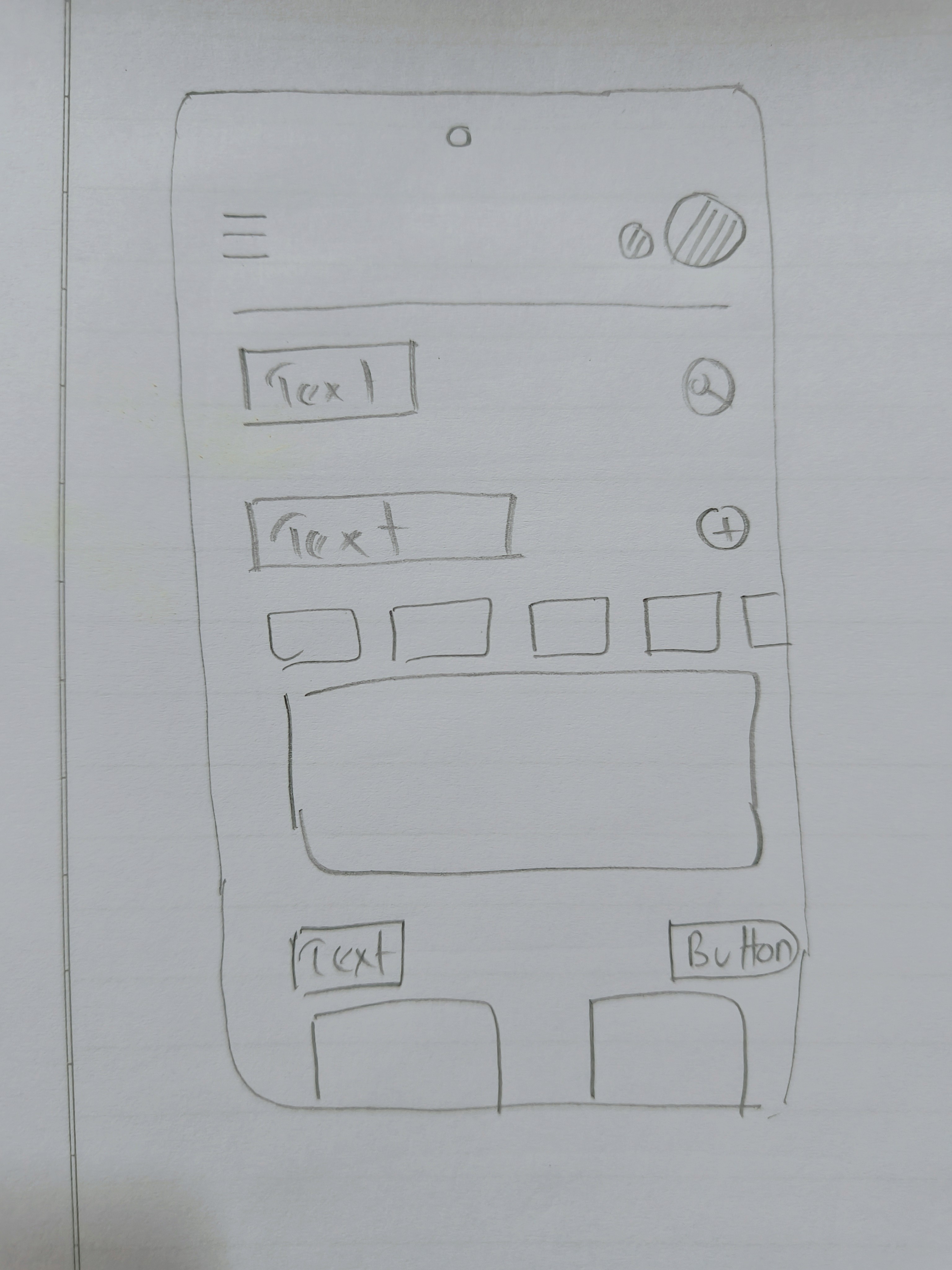
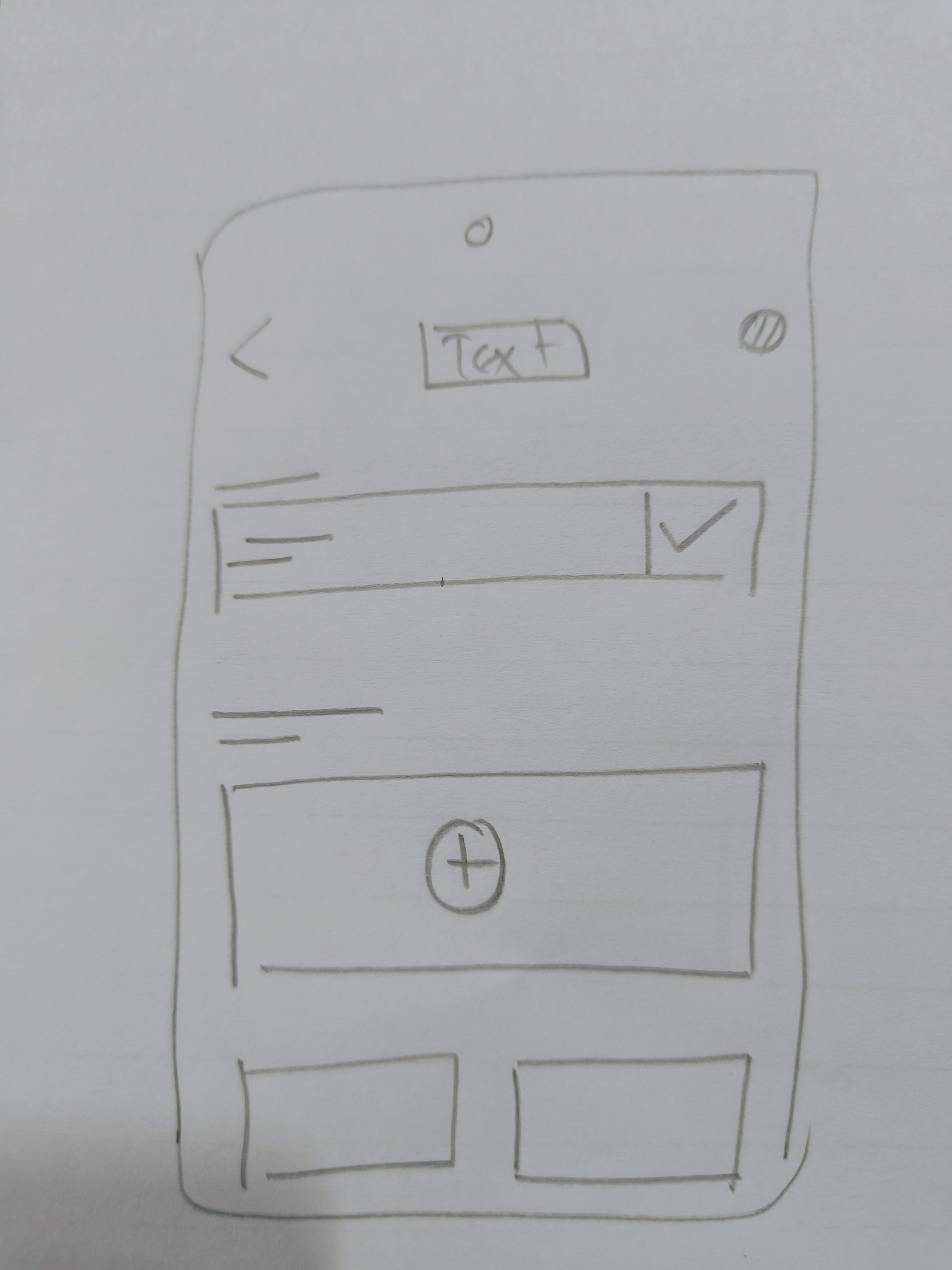
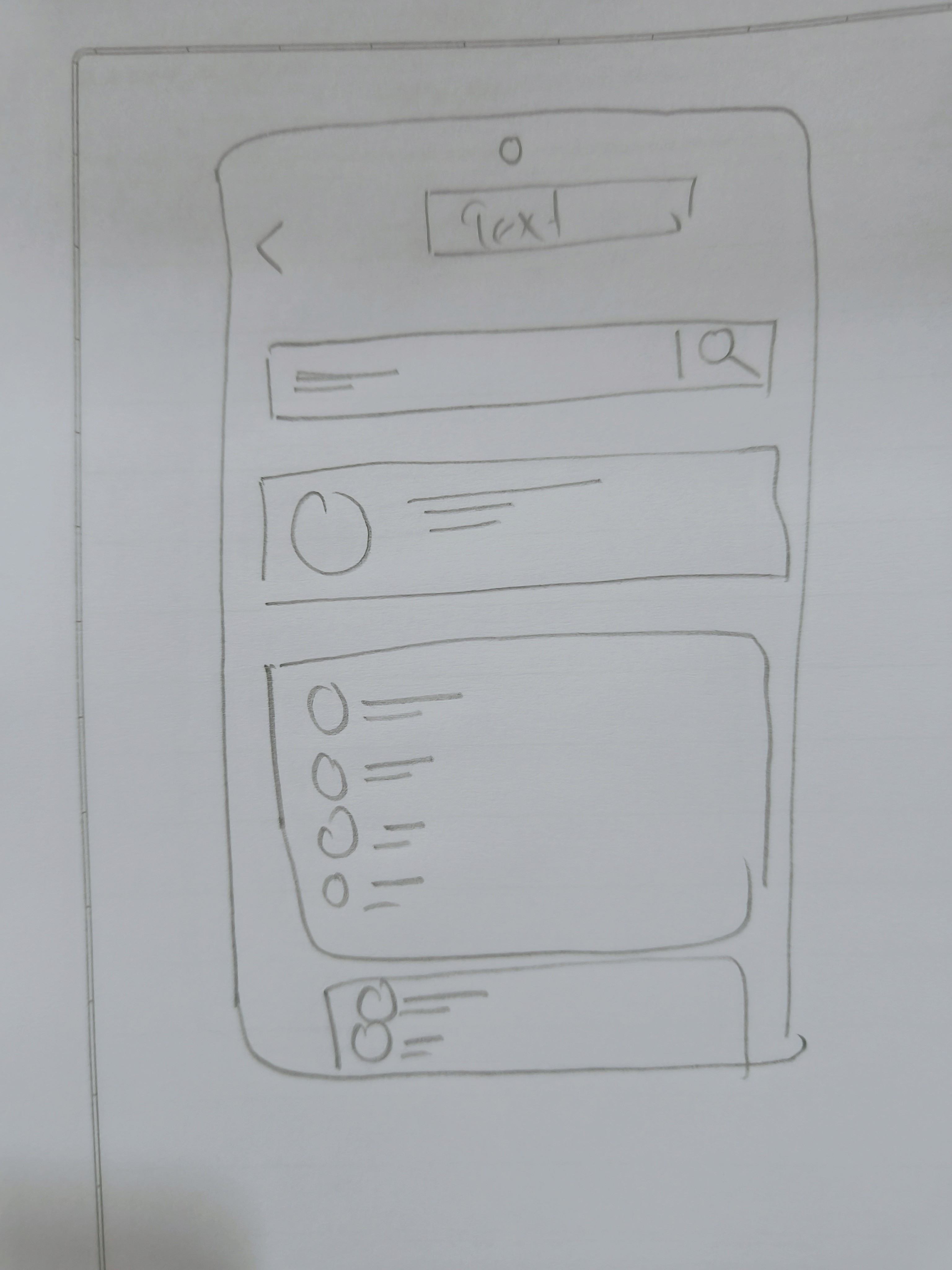
Sketches/Low-fidelity Wireframes


High Fidelity Screen 1
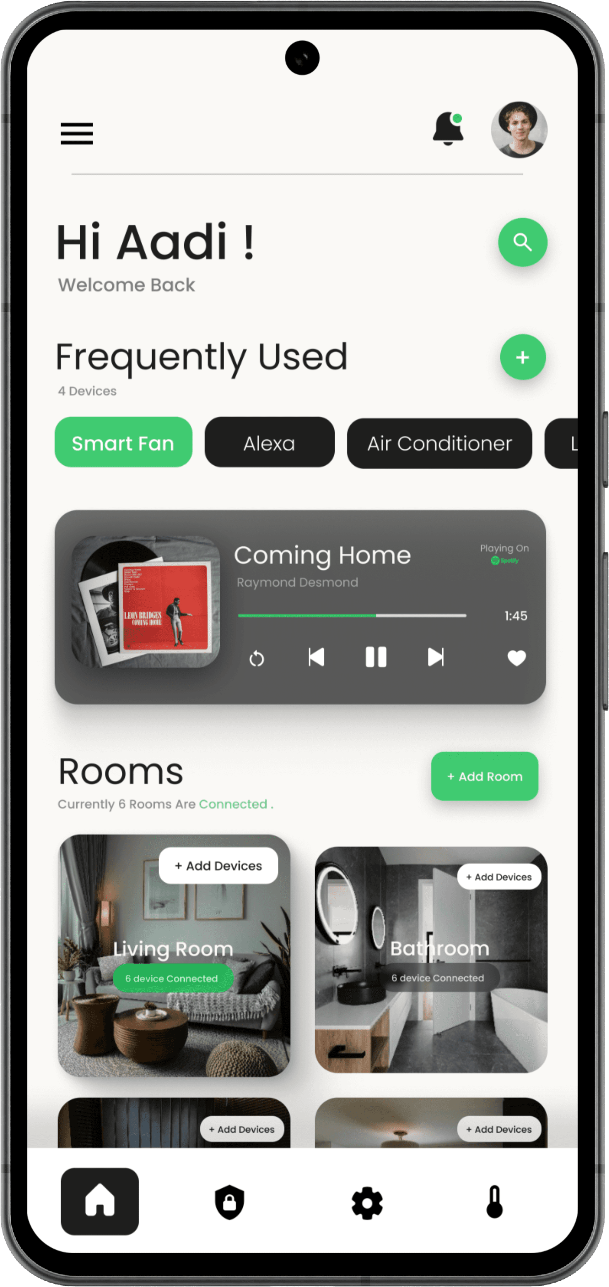
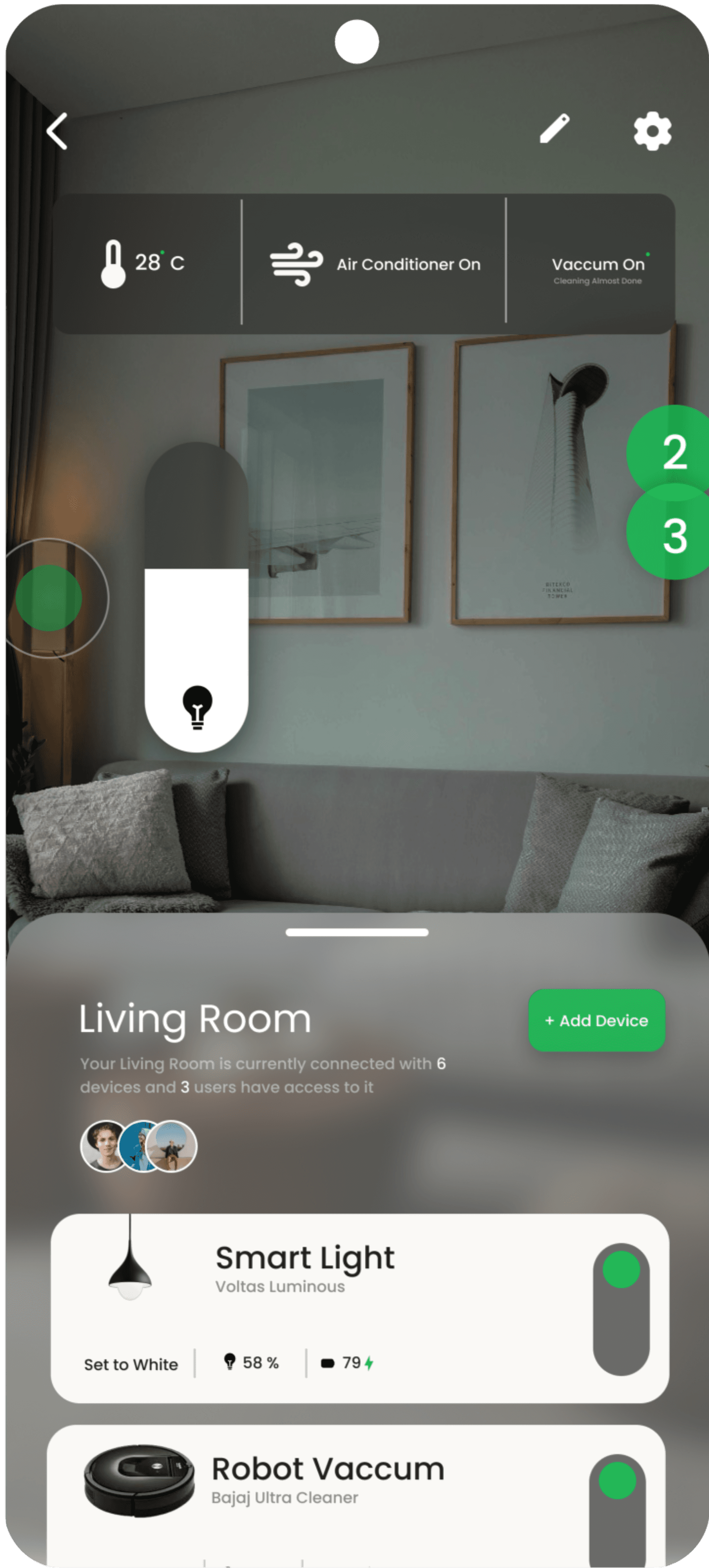
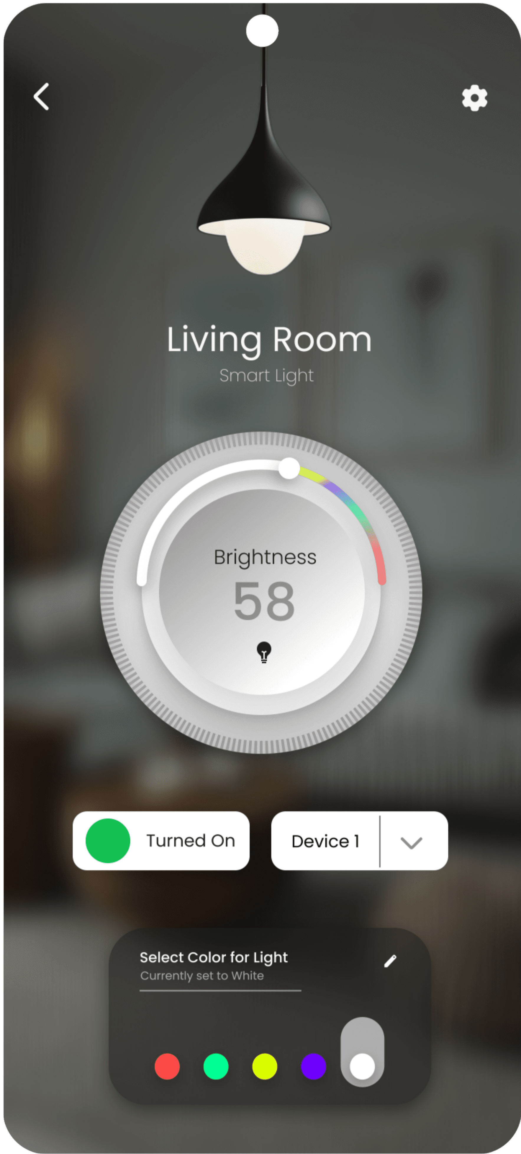
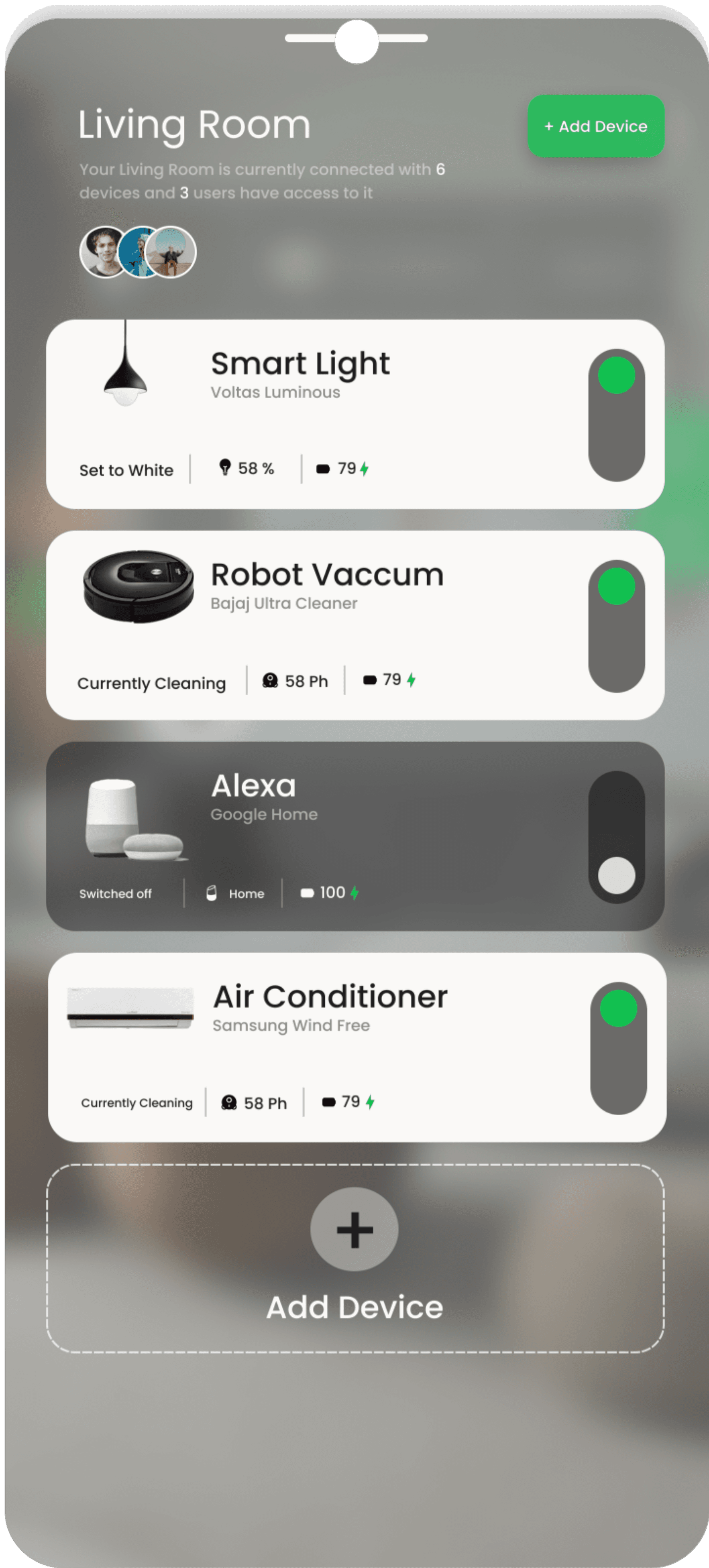
Home Screen
This screen serves as the home dashboard for the Homely Smart Home Application. It greets the user by name, offering a personalized welcome. The interface is divided into sections: "Frequently Used" devices are displayed at the top for quick access, allowing control of common devices like the Smart Fan, Alexa, and Air Conditioner
Below, the "Rooms" section organizes connected devices by room, such as the Living Room and Bathroom, with options to add new rooms and devices. The design emphasizes simplicity and ease of navigation with clear icons and labels.


Information Architecture/User Flow
Home Screen
Login
Onboarding
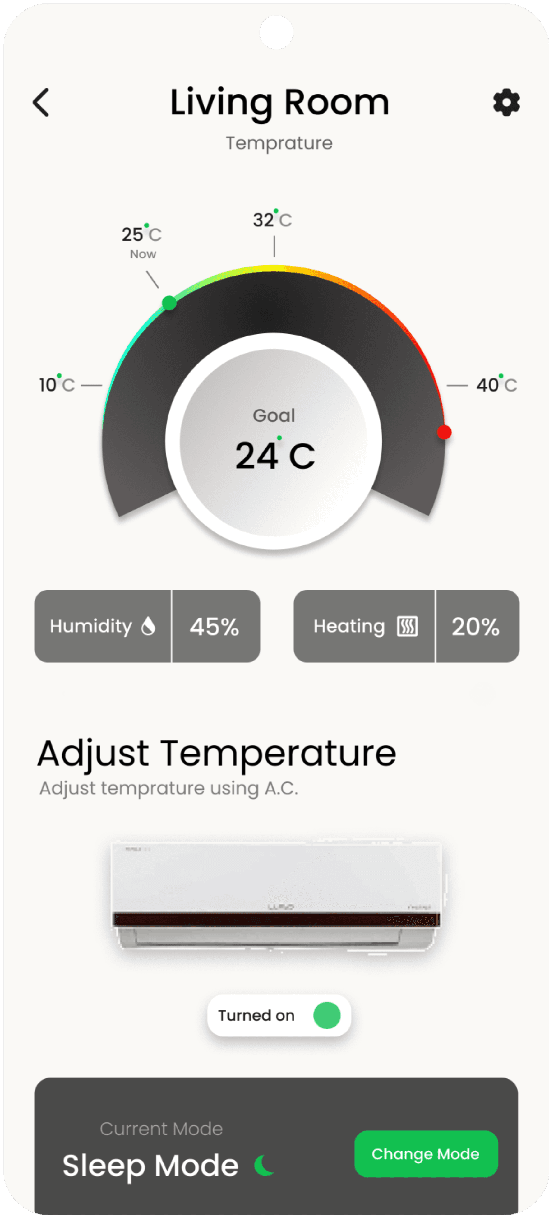
All Room Temp
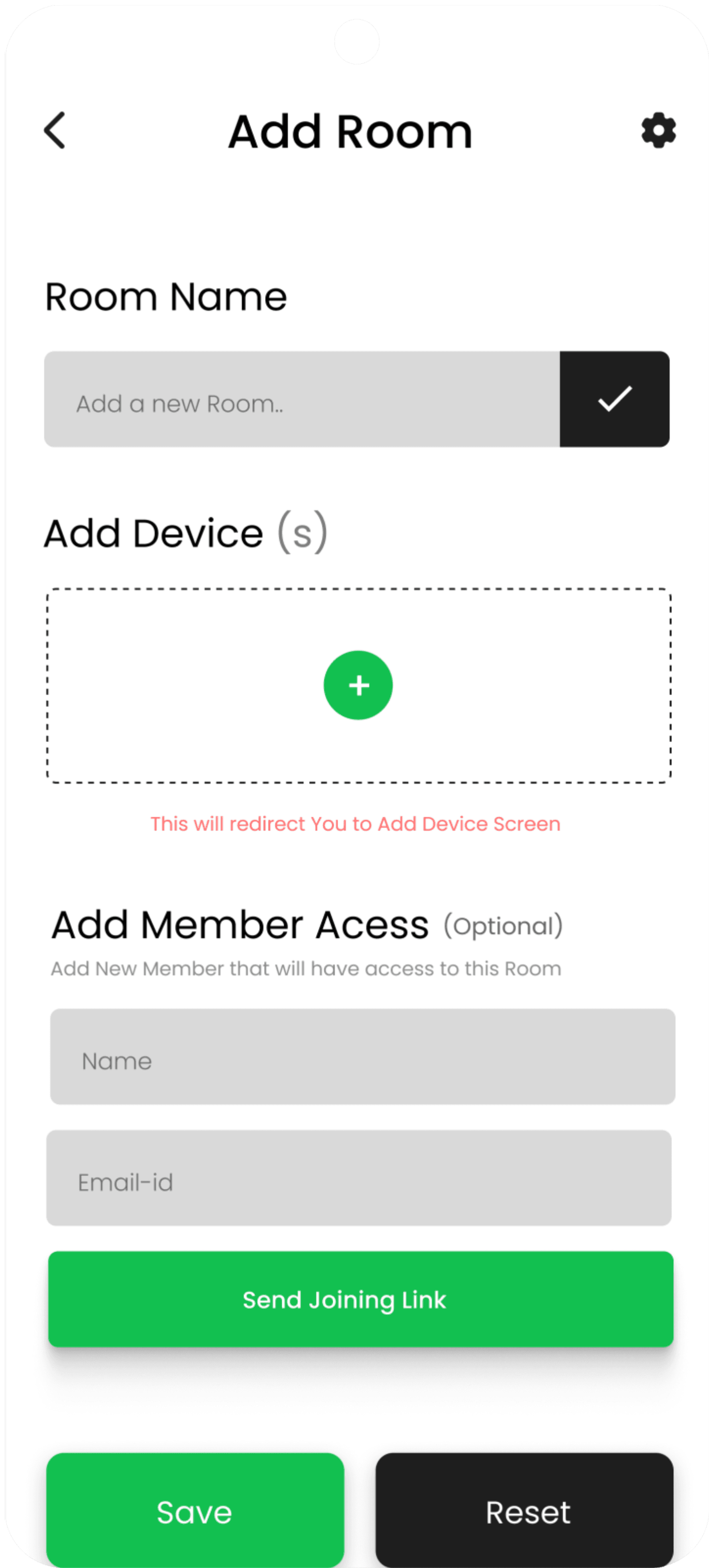
Add Room
Show Details For Each room
Control Temp Of specific Temp
Add Room Secodary
Add Room Screen
Search Bar
Account Info
Settings Options
Weather
Security
Settings
Temprature
Home
Notifications
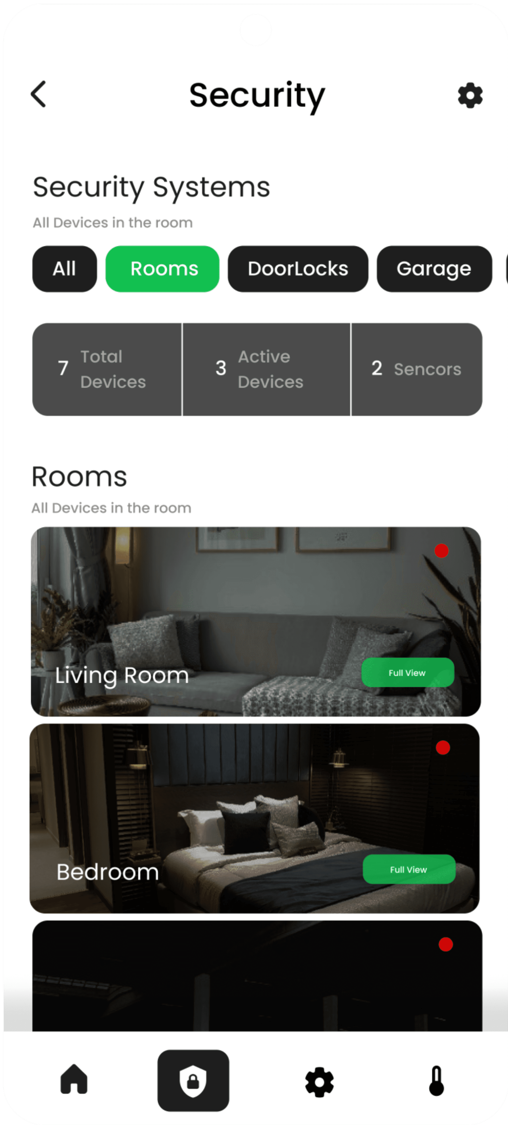
Security screen
All Devices
Camera ,Mics,etc
Full View
Total Devices
Active Devices
Devices
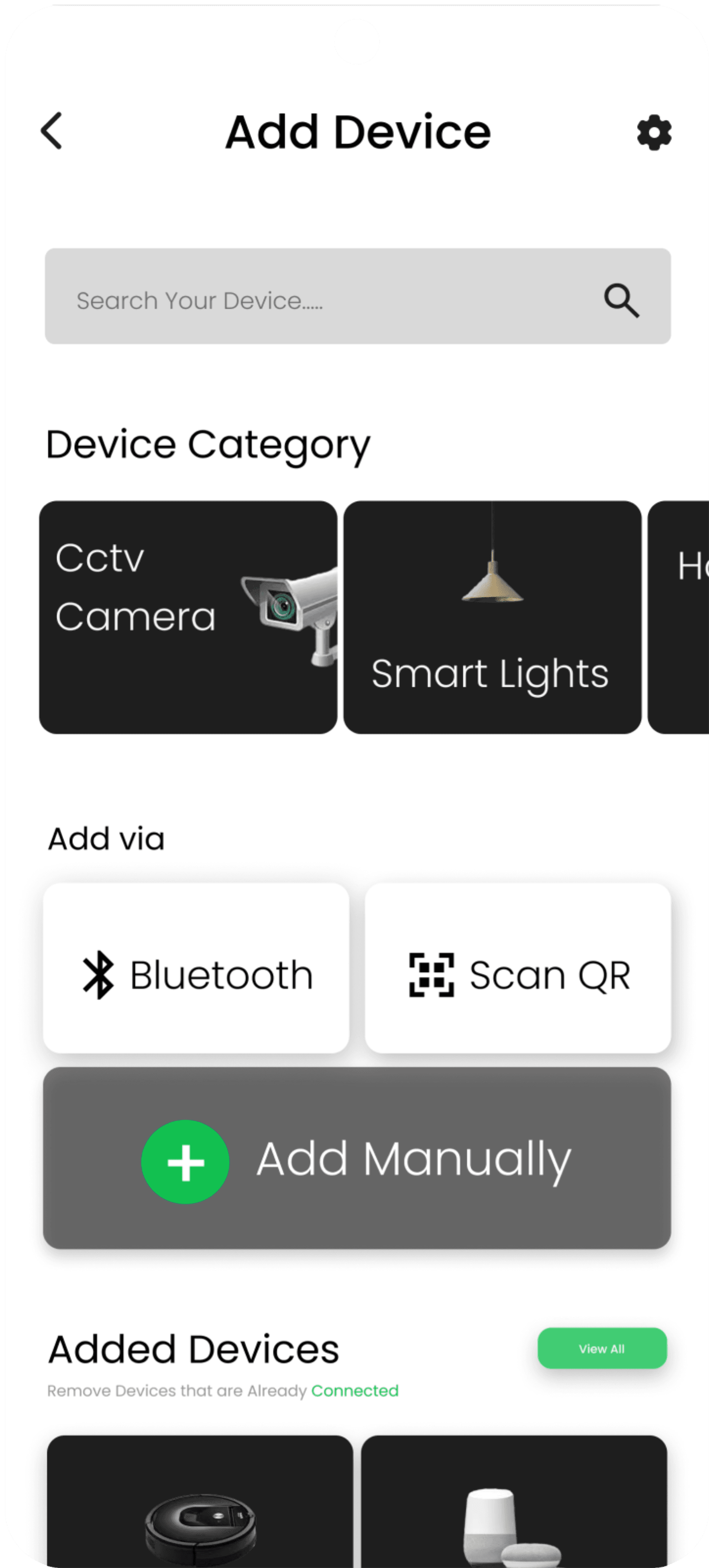
Add Device Screen
Roons
Security
Music
Settings
Help
Log out
Side Bar
Profile
Music Controls
Rooms
Add Devices
Tap to Get Specific Controls
Livings Room Controls
Frequently Used
Start
High Fidelity Screen 2
This screen is the Google account selection interface for the Homely Smart Home Application. Users are prompted to choose from a list of Google accounts to continue. The design is minimalistic, with a focus on clarity and ease of use, allowing users to quickly select their account.
The background is blurred, maintaining the app’s clean and modern aesthetic. A "Next" button at the bottom leads to the next step, and the back arrow allows users to return to the previous screen.

Login Screen
All Screens


Prototype
Thanks for Reading !